Implementing Dark Theme in a React App with Vite, TypeScript, and Tailwind CSS
A step-by-step guide to setting up a dark theme in your React application using Vite as the build tool, TypeScript for type safety, and Tailwind CSS.


Table of contents
- GitHub Repository
- Demo
- Getting Started
- Setting Up Tailwind CSS
- Tailwind Prettier
- Removing Unwanted Code
- Creating the types for ThemeContext
- The Folder-By-Feature Pattern
- Barrel Files
- Check If Context Works Properly Or Not
- Update Theme On Toggle
- Enable Dark Mode By Default
- Persist User Choice
- Opacity Bug
- Conclusion
Are you looking to add a dark theme to your React application? Dark themes not only provide a visually appealing aesthetic but also offer a better user experience, especially in low-light environments. In this step-by-step guide, I'll walk you through the process of implementing a dark theme in your React app using Vite as the build tool, TypeScript for enhanced type safety, and Tailwind CSS for efficient and responsive styling.
By following this tutorial, you'll learn how to set up the development environment, integrate Tailwind CSS for rapid styling, and leverage the power of TypeScript for robust code. We'll also explore handy tools like Tailwind Prettier to streamline your development workflow. So, let's dive in and bring the elegance of a dark theme to your React application!
GitHub Repository
You can access the complete source code and project files in the GitHub repository. Feel free to explore the code, fork the repository, or contribute to further enhance the theme-switching functionality.
Demo
We have provided a live demo of the implemented theme-switching functionality, which you can access here. Feel free to try it out and see the theme switching in action. Experience the seamless transition between light and dark modes and observe how the colors adapt dynamically.
Getting Started
To start, let's set up our project using Vite. Open your terminal and run the following command:
yarn create vite --template react-ts
This will scaffold a new project with the necessary dependencies and configuration files. Follow the instructions provided to install the dependencies, and run the dev server.
Setting Up Tailwind CSS
To integrate Tailwind CSS into our project, we can follow the official guide provided by Tailwind CSS. The guide can be found at the following link: tailwindcss.com/docs/guides/vite
Tailwind Prettier
Tailwind Prettier is a plugin that simplifies working with Tailwind CSS. It automatically sorts and organizes your CSS classes, improving your development workflow. To install Tailwind Prettier, run the following command:
yarn add -D prettier prettier-plugin-tailwindcss
For more information on how to use Tailwind Prettier, refer to the following link: tailwindcss.com/blog/automatic-class-sortin..
Removing Unwanted Code
Now that we have set up Tailwind CSS, we can remove unnecessary code from our project. Delete the assets folder, App.css file, and most of the content from index.css and App.tsx. The resulting files should look as follows:
src/index.css
@tailwind base;
@tailwind components;
@tailwind utilities;
src/app.tsx
function App() {
    return (
        <div className="flex h-screen w-screen items-center justify-center bg-slate-950 text-white">
            <h1>Hello World</h1>
        </div>
    );
}

export default App;
To verify that our changes have been applied correctly, run the app in development mode using the following command if you haven't already
yarn run dev
And make sure your website looks like this:

Creating the types for ThemeContext
To implement the dark theme functionality, we start by creating a types.ts file in the src directory. This file will define the interface for our ThemeContext.
Create a file named types.ts in the src directory and add the following code:
src/types.ts
export interface ThemeContextInterface {
    darkTheme: boolean;
    toggleTheme(): void;
}
In the ThemeContextInterface, we define two properties:
darkTheme: a boolean value indicating whether the dark theme is active or not.toggleTheme: a function that will be used to toggle the theme from other components.
By defining this interface, we establish the structure and functionality of our ThemeContext.
The Folder-By-Feature Pattern
The Folder-by-Feature pattern, also known as Feature-based organization or Domain-driven organization, emphasizes grouping related files and components together based on their functionality or feature. Instead of organizing files by their type (e.g., components, styles, tests), this pattern encourages developers to structure their codebase around features or modules.
Here's an example to illustrate how the pattern works: Imagine we have three components: Header, Navbar, and Footer. Rather than scattering these components across different folders, we create a "components" folder and place each component in its own file, such as Header.tsx, Navbar.tsx, and Footer.tsx. These component files are then organized within a "components" folder, which acts as a container for related components.
Barrel Files
To streamline importing and enhance module encapsulation, the Folder-by-Feature pattern commonly employs a technique called barrel files. A barrel file (index.ts) is placed within each feature folder and serves as a central export point for the components within that folder. For example, within the "components" folder, an index.ts file would include statements like export * from "./Header" and export * from "./Navbar". This allows us to import multiple components from the folder using a single import statement like import { Header, Navbar } from "./components".
To create the necessary files and folders for our context and provider, follow these steps:
Create two folders named
contextsandprovidersin your project directory.Inside the
contextsfolder, create a file namedThemeContext.tsxwith the following content:
contexts/ThemeContext.tsx
import { createContext } from "react";
import { ThemeContextInterface } from "../types";

export const ThemeContext = createContext<ThemeContextInterface | null>(null);
This file imports the createContext function from React and creates a context called ThemeContext using the createContext function. It also imports the ThemeContextInterface from the types.ts file.
- Inside the
providersfolder, create a file namedThemeProvider.tsxwith the following content:
providers/ThemeProvider.tsx
import { useState } from "react";
import { ThemeContext } from "../contexts";

export const ThemeProvider = ({ children }: { children: React.ReactNode }) => {
    const [darkTheme, setDarkTheme] = useState<boolean>(false);

    const toggleTheme = () => {
        setDarkTheme((curr) => !curr);
    };

    return (
        <ThemeContext.Provider value={{ darkTheme, toggleTheme }}>
            {children}
        </ThemeContext.Provider>
    );
};
This file defines a ThemeProvider component that serves as the provider for our theme context. It uses the useState hook to manage the darkTheme state and provides a toggleTheme function to toggle the theme. The component wraps the children prop with the ThemeContext.Provider and provides the darkTheme and toggleTheme values as the context value.
- In the
contextsfolder, create anindex.tsfile with the following content:
contexts/index.ts
export * from "./ThemeContext";
This barrel file exports the ThemeContext from the ThemeContext.tsx file. This allows us to import the context using a single import statement.
- In the
providersfolder, create anindex.tsfile with the following content:
providers/index.ts
export * from "./ThemeProvider";
This barrel file exports the ThemeProvider from the ThemeProvider.tsx file. Similar to the previous barrel file, this allows us to import the provider using a single import statement.
By following these steps, you have created the necessary files and folders for your context and provider. The barrel files help streamline importing.
The separation of the context and provider into separate files avoids any potential issues with Hot Module Replacement (HMR) in Vite. You can read more about it on this thread: https://github.com/vitejs/vite/issues/3301
Check If Context Works Properly Or Not
To check if the context is working correctly, follow these steps:
- Open the
src/main.tsxfile and update it with the following code:
import ReactDOM from "react-dom";
import App from "./App";
import { ThemeProvider } from "./providers";

ReactDOM.render(
    <ThemeProvider>
        <App />
    </ThemeProvider>,
    document.getElementById("root")
);
This code wraps the App component with the ThemeProvider component, providing the theme context to the app.
- Open the
src/App.tsxfile and update it with the following code:
import { useContext } from "react";
import { ThemeContext } from "./contexts";
import { ThemeContextInterface } from "./types";

function App() {
    const { darkTheme, toggleTheme } = useContext(ThemeContext) as ThemeContextInterface;

    return (
        <div className="flex h-screen w-screen items-center justify-center bg-slate-950 text-white">
            <div className="rounded-md bg-white p-8 text-black">
                <h1 className="text-3xl">Theme {darkTheme ? "dark" : "light"}</h1>
                <button
                    onClick={toggleTheme}
                    className="mt-2 w-full rounded-none bg-slate-600 p-2 text-2xl text-white transition-all duration-300 ease-in-out hover:rounded-lg"
                >
                    Toggle
                </button>
            </div>
        </div>
    );
}

export default App;
This code uses the useContext hook to access the theme context values, including darkTheme and toggleTheme. It displays the current theme status in the h1 element and provides a button to toggle the theme.
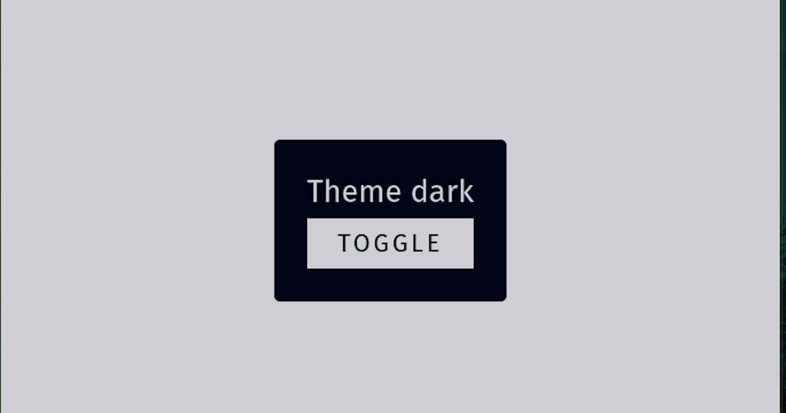
- Make sure to save the changes and run your application. Check if the toggle button works as expected and if the text changes from "Theme Light" to "Theme Dark" and vice versa when you click the button.
By following these steps, you can verify if the context is functioning correctly. The ThemeProvider wraps the App component, providing the theme context to all components within the app. The App component consumes the context using the useContext hook and displays the current theme status and a toggle button to change the theme.
To use CSS variables for the theme, follow these steps:
- Create CSS Variables: Open the
src/index.cssfile and add the following code:
@tailwind base;
@tailwind components;
@tailwind utilities;

:root {
    --bgColor: #ffffff;
    --textColor: #333333;
}

.theme-dark {
    --bgColor: #333333;
    --textColor: #ffffff;
}
In this code, we define two CSS variables: --bgColor and --textColor. These variables represent the background color and text color for the theme. The default values are set for the light theme, and the theme-dark class overrides the variables for the dark theme. You can adjust the color values based on your preferences.
- Update Tailwind Configuration: Open the
tailwind.config.jsfile and add the following code:
module.exports = {
  theme: {
    extend: {
      colors: {
        bgColor: 'var(--bgColor)',
        textColor: 'var(--textColor)',
      },
    },
  },
  variants: {},
  plugins: [],
};
This code extends the colors section of the Tailwind CSS theme configuration. We add two new color classes: bgColor and textColor, which references the CSS variables we defined earlier.
- Update App Component: Open the
src/App.tsxfile and modify the JSX code as follows:
return (
    <div className={`flex h-screen w-screen items-center justify-center bg-bgColor text-textColor`}>
        <div className="rounded-md bg-textColor p-8 text-bgColor">
            <h1 className="text-3xl">Theme {darkTheme ? "dark" : "light"}</h1>
            <button
                onClick={toggleTheme}
                className="mt-2 w-full rounded-none bg-bgColor p-2 text-center text-2xl uppercase tracking-[3px] text-textColor transition-all duration-300 ease-in-out hover:rounded-lg"
            >
                Toggle
            </button>
        </div>
    </div>
);
In this code, we use the bg-bgColor and text-textColor classes to apply the background and text colors based on the CSS variables. The classes are derived from the color classes defined in the Tailwind configuration.
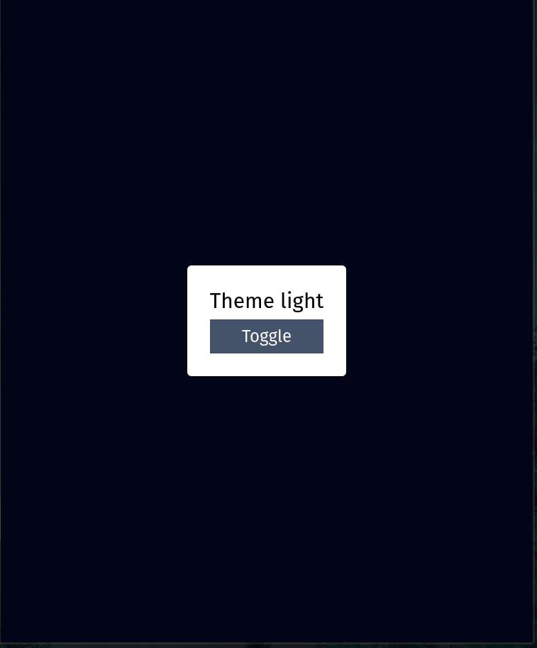
Make sure to save your changes and test the application. It won't currently toggle the theme as of now, but your website should now look like this:
Update Theme On Toggle
In order to update the theme on the toggle, you need to add a useEffect hook in the ThemeProvider component. Here's the updated code:
import { useState, useEffect } from "react";
import { ThemeContext } from "../contexts";

export const ThemeProvider = ({ children }: { children: React.ReactNode }) => {
    const [darkTheme, setDarkTheme] = useState<boolean>(false);

    const toggleTheme = () => {
        setDarkTheme((curr) => !curr);
    };

    useEffect(() => {
        document.body.className = darkTheme ? "theme-dark" : "theme-light";
    }, [darkTheme]);

    return (
        <ThemeContext.Provider value={{ darkTheme, toggleTheme }}>
            {children}
        </ThemeContext.Provider>
    );
};
In this code, we add a useEffect hook that listens for changes in the darkTheme state. When the darkTheme value changes, the effect sets the className of the document.body to either "theme-dark" or "theme-light". This will apply the appropriate CSS styles based on the selected theme.
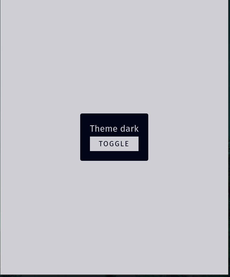
Make sure to save your changes and test the application. Now, when you toggle the theme using the toggleTheme function, the CSS classes will be updated, and the theme will change accordingly.
Enable Dark Mode By Default
To enable the dark mode by default based on the user's system preference, you can add an additional useEffect hook in the ThemeProvider component. Here's the updated code:
import { useState, useEffect } from "react";
import { ThemeContext } from "../contexts";

export const ThemeProvider = ({ children }: { children: React.ReactNode }) => {
    const [darkTheme, setDarkTheme] = useState<boolean>(false);

    const toggleTheme = () => {
        setDarkTheme((curr) => !curr);
    };

    useEffect(() => {
        if (
            window.matchMedia &&
            window.matchMedia("(prefers-color-scheme: dark)").matches
        ) {
            setDarkTheme(true);
        }
    }, []);

    useEffect(() => {
        document.body.className = darkTheme ? "theme-dark" : "theme-light";
    }, [darkTheme]);

    return (
        <ThemeContext.Provider value={{ darkTheme, toggleTheme }}>
            {children}
        </ThemeContext.Provider>
    );
};
In this code, we check if the window.matchMedia API is available and if the user's system preference matches the dark color scheme. If it does, we set the initial value of darkTheme to true, enabling the dark mode by default.
Make sure to save your changes and test the application. Now, when the website loads, it will check the user's system preference and automatically apply the dark mode if it's enabled.
Persist User Choice
To persist the user theme selection and retrieve the last chosen theme when the website is loaded again, you can modify the existing useEffect hook in the ThemeProvider component. Here's the updated code:
import { useState, useEffect } from "react";
import { ThemeContext } from "../contexts";

export const ThemeProvider = ({ children }: { children: React.ReactNode }) => {
    const [darkTheme, setDarkTheme] = useState<boolean>(false);

    const toggleTheme = () => {
        setDarkTheme((curr) => !curr);
    };

    useEffect(() => {
        const currentTheme = localStorage.getItem("theme");
        if (!currentTheme) {
            if (
                window.matchMedia &&
                window.matchMedia("(prefers-color-scheme: dark)").matches
            ) {
                setDarkTheme(true);
            }
        } else {
            setDarkTheme(currentTheme === "dark");
        }
    }, []);

    useEffect(() => {
        localStorage.setItem("theme", darkTheme ? "dark" : "light");
        document.body.className = darkTheme ? "theme-dark" : "theme-light";
    }, [darkTheme]);

    return (
        <ThemeContext.Provider value={{ darkTheme, toggleTheme }}>
            {children}
        </ThemeContext.Provider>
    );
};
In this code, we first check if there is a value stored in the localStorage with the key "theme". If there is no stored value, we proceed to check the user's system preference. If the system preference is set to dark mode, we set darkTheme to true. Otherwise, if there is a stored value in the localStorage, we use that to set the initial value of darkTheme.
When the darkTheme value changes, we update the localStorage with the new value and also update the document body's class name to apply the appropriate theme.
Now, when a user selects a theme, it will be stored in the localStorage and retrieved when the website is loaded again, ensuring that the last chosen theme persists.
Make sure to save your changes and test the application.
Opacity Bug
If you're experiencing an issue with the opacity property not working properly when using CSS variables for theming, you can follow the suggested solution provided in the YouTube video: https://youtu.be/MAtaT8BZEAo?t=1021
Conclusion
In this tutorial, we have learned how to implement a theme-switching functionality in a React application using CSS variables. By leveraging CSS variables, we can easily customize and switch between different themes without the need for complex conditional styling.
We followed the Folder-by-Feature pattern to organize our codebase, grouping related files and components together based on their functionality. This pattern promotes modularity and scalability, making it easier to manage and maintain our code.
To implement the theme-switching feature, we created a ThemeContext component using the createContext function from React. This context provided a centralized place to store and access the theme-related data throughout our application.
We also developed a ThemeProvider component responsible for managing the theme state and providing it to the rest of the components. By utilizing the useState hook, we were able to toggle the theme between light and dark modes.
To ensure seamless theming, we used CSS variables defined in the tailwind.config.js file. By setting the colors for bgColor and textColor using CSS variables, we achieved dynamic theming without the need to explicitly define separate CSS classes for each theme.
Additionally, we implemented persistence of the selected theme using localStorage. By storing the theme preference in the browser's local storage, we were able to remember the user's choice even after they closed the website.
Overall, the approach we took allows for easy customization and extensibility, enabling the addition of multiple themes if desired. With the power of CSS variables and React's context API, we can create dynamic and engaging user experiences that adapt to the user's preferences.
I hope this tutorial has been helpful in understanding how to implement theme switching in your React applications. If you have any questions or need further assistance, feel free to reach out. Thank you for reading, and I appreciate any feedback you may have to improve this tutorial.